
Disneyland App Re-design: Genie Service
Disney Genie service is a complimentary service that currently creates your best Disney day inspired by your party’s top interest and can make dining and activity reservations in advance, to help make your day magical.
MY ROLE:
UX/UI designer
UX researcher
TOOLS USED:
Adobe XD
Pen and paper
TIMELINE:
2 weeks
THE PROBLEM
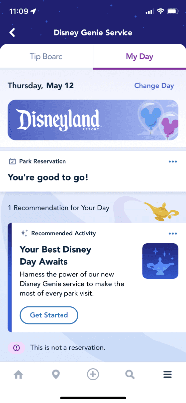
The “personalized itinerary” on the ‘My Day’ tab does not show users their previous selected items. It only shows Disney’s recommendations, resulting in frustration because there is no overall day view of the user’s picks.
THE SOLUTION
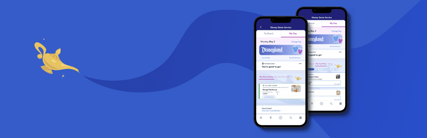
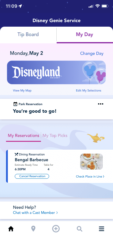
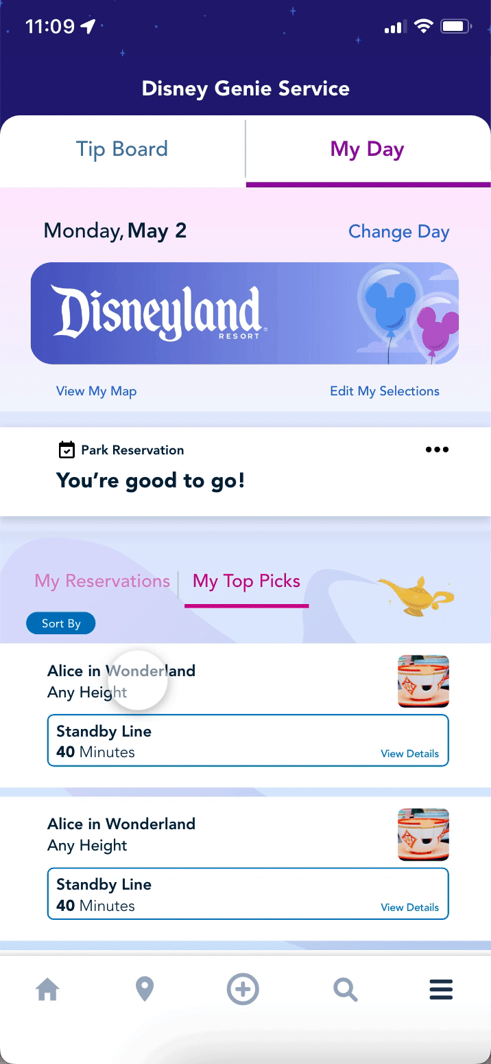
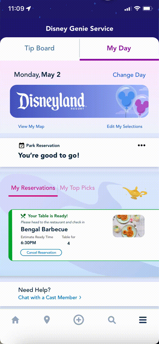
The ‘Tip Board’ tab will be Disney suggestions and attraction lists that could be added to what you want to visit. The ‘My Day’ tab will show all your prior chosen attractions, see your reservations, and can swipe to check off what you planned.
- A tab for better access to reservations and top picks
- Under the ‘top picks’ tab, users should be able to see what the pre-selected and can check off what they went on to keep track on what they wanted to go on.
THE PROCESS
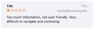
I WAS FRUSTRATED
Recently, I went to Disneyland with a few friends and we decided to give Disneyland’s complimentary Genie Service a try. However, throughout the day, we found it was confusing to use. Of course we wanted to maximize our day, but the ‘Tip Board’ and ‘My Day’ tabs were the giving “suggestions” and not what we picked.
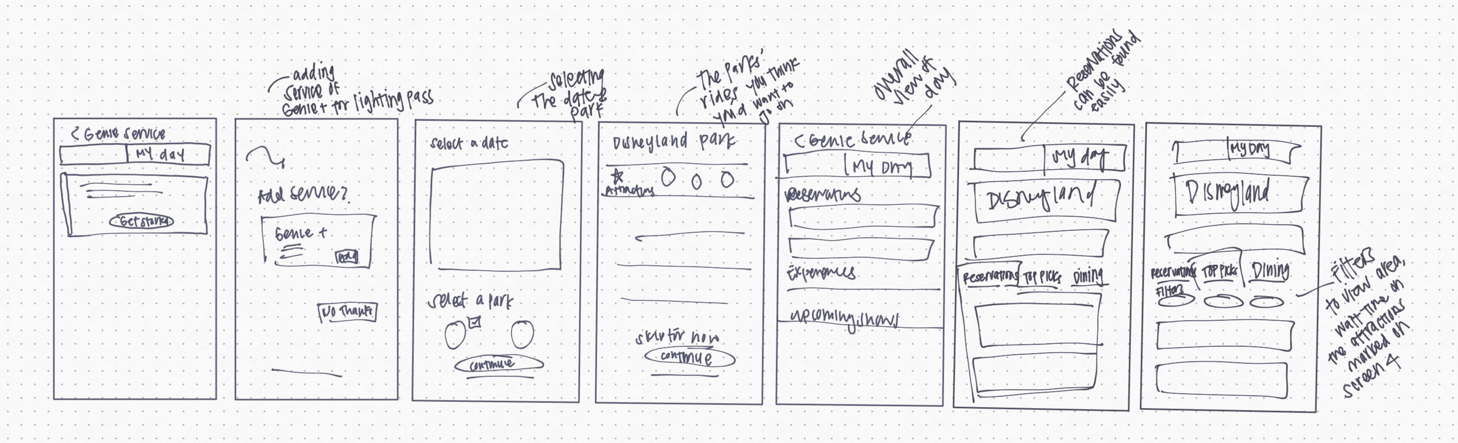
So, I’ve decided to see if I can create an alternative to better use the two tabs and design the ‘my day’ tab homepage as if we are using the app on the day of the park visit.
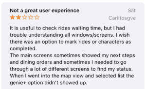
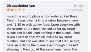
SO, I BEGAN LOOKING AT REVIEWS
AND THOUGHT, 'WHAT IF...'
Based on the gathered information, users seem to want the app to show wait times for rides, show reservations, and recommendations on what to do next. So I began drawing my ideas on how to show those pain points. I began asking myself,… ‘what if someone like me want to have a personalized itinerary?’
‘what if the tabs served different purposes?’
‘what if more people was able to use the app to it’s full potential?’
WHAT I WOULD CHANGE
After brainstorming, I felt like the two things I would concentrate on: 1. spotlighting the reservations and 2. an indication that the ride visitors come from all over the world comes to have been ridden.
FINAL PRODUCT
IN CONCLUSION
Disney’s app’s complimentary Genie Service has potential to make any Disney visit magical. Making more actions visible makes more people want to use the app more. Users do not want to think so a direct place where they can find the actions they want will make more people want to use the app.
Some key metrics that could measure the success of implementing this feature, is how many people show on time for their reservations made from the app because the app was able to notify the visitors their reservations and was able to remember they made a reservation. I would also test if users found the check mark useful or is it more confusing.
If I were to re-do this project, I would include a 5 step walk-through of what each button does in the app so visitors could maximize their use of the app.